HTML

HTML Layout

HTML Layout: Crafting Effective Web Page Structures

HTML Layout

HTML layouts form the foundation of web page design, providing structure and organization to content. Mastering HTML layout techniques ensures your web pages are well-organized, visually appealing, and functional across various devices.

Key Concepts in HTML Layout

  1. HTML Layout Elements

    • Block-Level Elements: These elements start on a new line and extend to the full width of their container. Examples include <div>, <header>, <footer>, and <section>.
    • Inline Elements: These elements do not start on a new line and only take up as much width as necessary. Examples include <span>, <a>, and <strong>.
  2. Layout Techniques

    • Grid Layout: A CSS Grid layout provides a flexible and efficient way to create complex layouts.
    • Flexbox Layout: Flexbox is a one-dimensional layout method for arranging items in rows or columns.
    • CSS Frameworks: Frameworks like Bootstrap offer pre-defined grid systems and components to streamline layout design.

Basic HTML Layout Structure

A well-structured HTML layout usually consists of several key sections:

  • Header: Contains navigation and branding elements.
  • Main Content: The primary area for page content.
  • Sidebar: Optional section for additional content or links.
  • Footer: Includes copyright information, contact details, and other footer content.

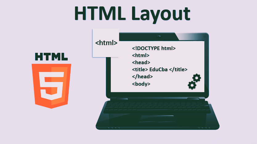
Example: Basic HTML Layout for Codeezy

Here’s a simple example illustrating a basic HTML layout using Codeezy’s context:

				
					<!DOCTYPE html>
<html>
<head>
    <title>Codeezy Web Layout</title>
    <style>
        body {
            font-family: Arial, sans-serif;
            margin: 0;
            padding: 0;
        }
        header {
            background-color: #1d6b0d;
            color: white;
            padding: 1rem;
            text-align: center;
        }
        main {
            display: flex;
            justify-content: space-between;
            padding: 2rem;
        }
        .sidebar {
            width: 25%;
            background-color: #f4f4f4;
            padding: 1rem;
        }
        .content {
            width: 70%;
        }
        footer {
            background-color: #1d6b0d;
            color: white;
            text-align: center;
            padding: 1rem;
            position: fixed;
            bottom: 0;
            width: 100%;
        }
    </style>
</head>
<body>
    <header>
        <h1>Welcome to Codeezy</h1>
        <nav>
            <a href="#">Home</a> | <a href="#">Blog</a> | <a href="#">Contact</a>
        </nav>
    </header>
    <main>
        <div class="sidebar">
            <h2>Sidebar</h2>
            <p>Additional links and content go here.</p>
        </div>
        <div class="content">
            <h2>Main Content</h2>
            <p>This is where the primary content of the page will be displayed. Here you can add articles, blog posts, or other important information.</p>
        </div>
    </main>
    <footer>
        <p>&copy; 2024 Codeezy. All rights reserved.</p>
    </footer>
</body>
</html>


Explanation:

  • Header: Contains the site’s title and navigation links, styled with a background color and centered text.
  • Main: Utilizes Flexbox for layout with a sidebar and main content area.
  • Footer: Positioned at the bottom of the page with fixed width.

Advanced Layout Techniques

CSS Grid Layout

    • CSS Grid allows for creating complex, responsive layouts. Define rows and columns for intricate designs.
    • Example:
				
					<style>
    .grid-container {
        display: grid;
        grid-template-columns: repeat(3, 1fr);
        gap: 1rem;
    }
    .grid-item {
        background: #f4f4f4;
        padding: 1rem;
    }
</style>
<div class="grid-container">
    <div class="grid-item">Item 1</div>
    <div class="grid-item">Item 2</div>
    <div class="grid-item">Item 3</div>
</div>


Flexbox Layout

  • Flexbox is ideal for aligning items within a container. It simplifies alignment and distribution of space.
  • Example
				
					<style>
    .flex-container {
        display: flex;
        justify-content: space-around;
        align-items: center;
    }
    .flex-item {
        background: #ddd;
        padding: 1rem;
    }
</style>
<div class="flex-container">
    <div class="flex-item">Item 1</div>
    <div class="flex-item">Item 2</div>
    <div class="flex-item">Item 3</div>
</div>


CSS Frameworks

Tools like Bootstrap or Foundation offer pre-designed components and a grid system to streamline layout creation. They provide responsive design options and reduce development time.

Best Practices for HTML Layout

  • Use Semantic Elements: Utilize HTML5 semantic elements like <header>, <footer>, <main>, and <section> for better structure and SEO.
  • Ensure Responsiveness: Implement responsive design techniques to ensure layouts work well on various devices and screen sizes.
  • Optimize Performance: Minimize the use of unnecessary elements and CSS to enhance page load times.

Conclusion

Mastering HTML layout is crucial for creating well-structured, visually appealing, and functional web pages. By understanding and applying various layout techniques, including Flexbox and CSS Grid, you can design web pages that are both user-friendly and responsive.

HTML Layout – FAQs

What is HTML layout? HTML layout refers to the arrangement and structure of elements on a webpage, achieved using HTML and styled with CSS.

What are block-level elements used for? Block-level elements (e.g., <div>, <p>) create larger containers that stack vertically and take up the full width of their parent container.

What are inline elements used for? Inline elements (e.g., <span>, <a>) fit within block-level elements and do not break the flow of content, allowing for detailed styling within text.

What is a responsive layout? A responsive layout adjusts its design based on screen size and device orientation, ensuring accessibility and usability on various devices through CSS media queries.

How do you create a grid layout? Use CSS Grid Layout properties like grid-template-columns and grid-template-rows to create flexible and complex layouts with defined rows and columns.

Thank You for Visiting Codeezy.org!

We’re thrilled to have you as part of our coding community. Your engagement and support inspire us to continue providing high-quality resources and tools to enhance your web development journey. Whether you’re a beginner or an experienced coder, we hope you found valuable insights and tools here at Codeezy.

Stay connected for more tips, tutorials, and updates to help you code with ease. Thank you for choosing Codeezy.org—your growth as a developer is our motivation!

Happy coding!